What’s so special about Black and White photography?
There's a age old conversation in photography around black and white VS. colour and is black and white more artistic than colour?
I want to have an open discussion here, as if we’re out for dinner or getting coffee. There is no right or wrong but I do have a few opinions on this. So I thought it could be fun to talk about it.
So question one… why do some people think B&W is more artist than colour? I think the reasoning for all of this is more interesting than the conclusion.
B&W isn’t real.
I want to start with perhaps an obvious point, that B&W isn't real life.
Black and white is not what your eyes see when you walk out the door.
The world is in colour and the moment you take that away, you've already done something to an image. You've made a decision. You've reinterpreted reality rather than just documenting and recording it.
As Joel Sterneld once said: "Black and white is abstract; colour is not. Looking at a black and white photograph, you are already looking at a strange world."
The moment a photograph becomes “strange” as Joel said - it asks you to look differently. And is that when people consider something more ‘arty’? I don’t know, it’s just an idea.
When you look at a b&w image, it’s not real and you know it’s not.
That's the most useful way I've found to think about it. Colour tells you what something looked like. Black and white tells you what it felt like. Or at least - it’s open for you to decide.
"Colour is descriptive. Black and white is interpretive." - Elliott Erwitt
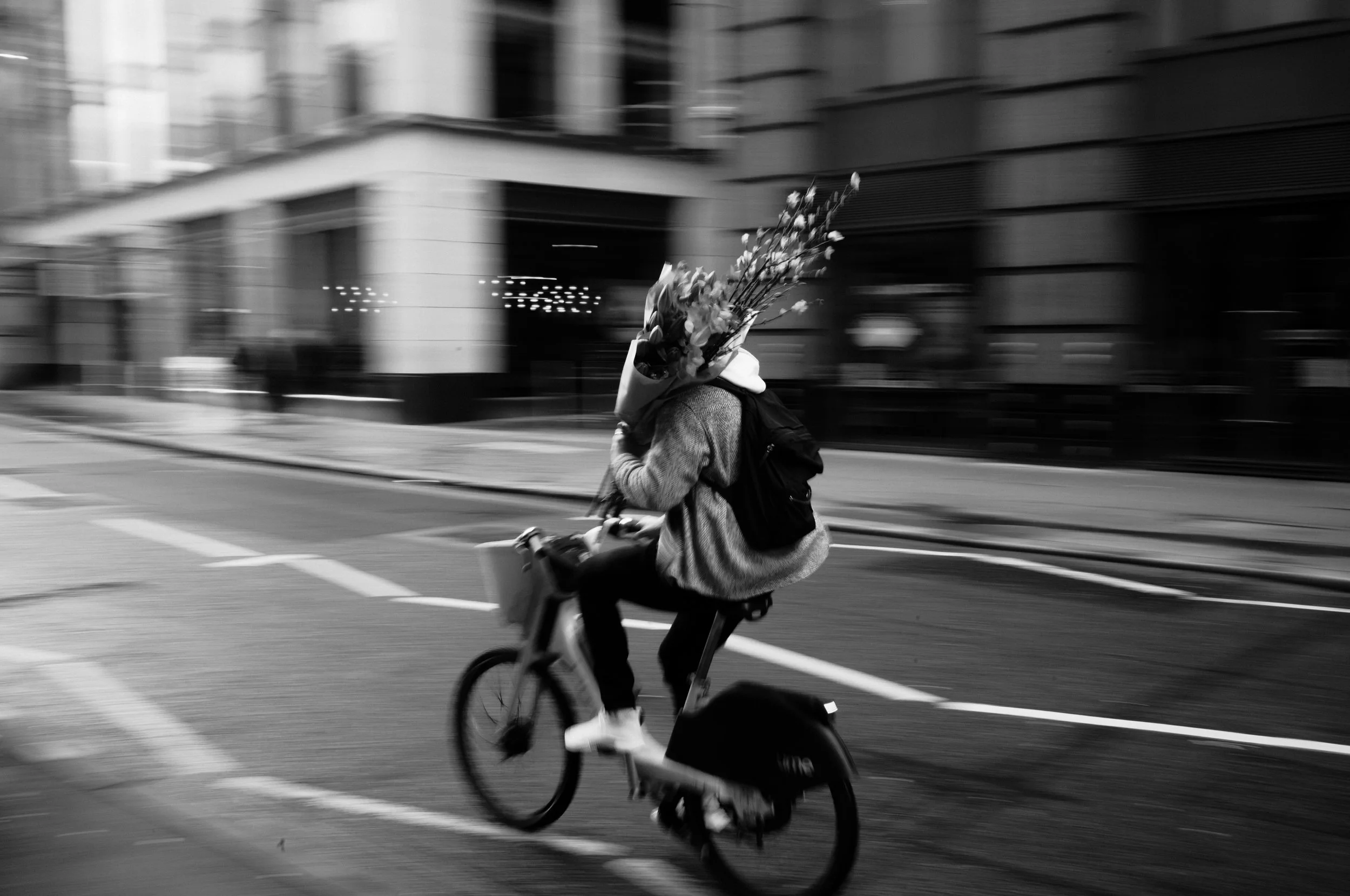
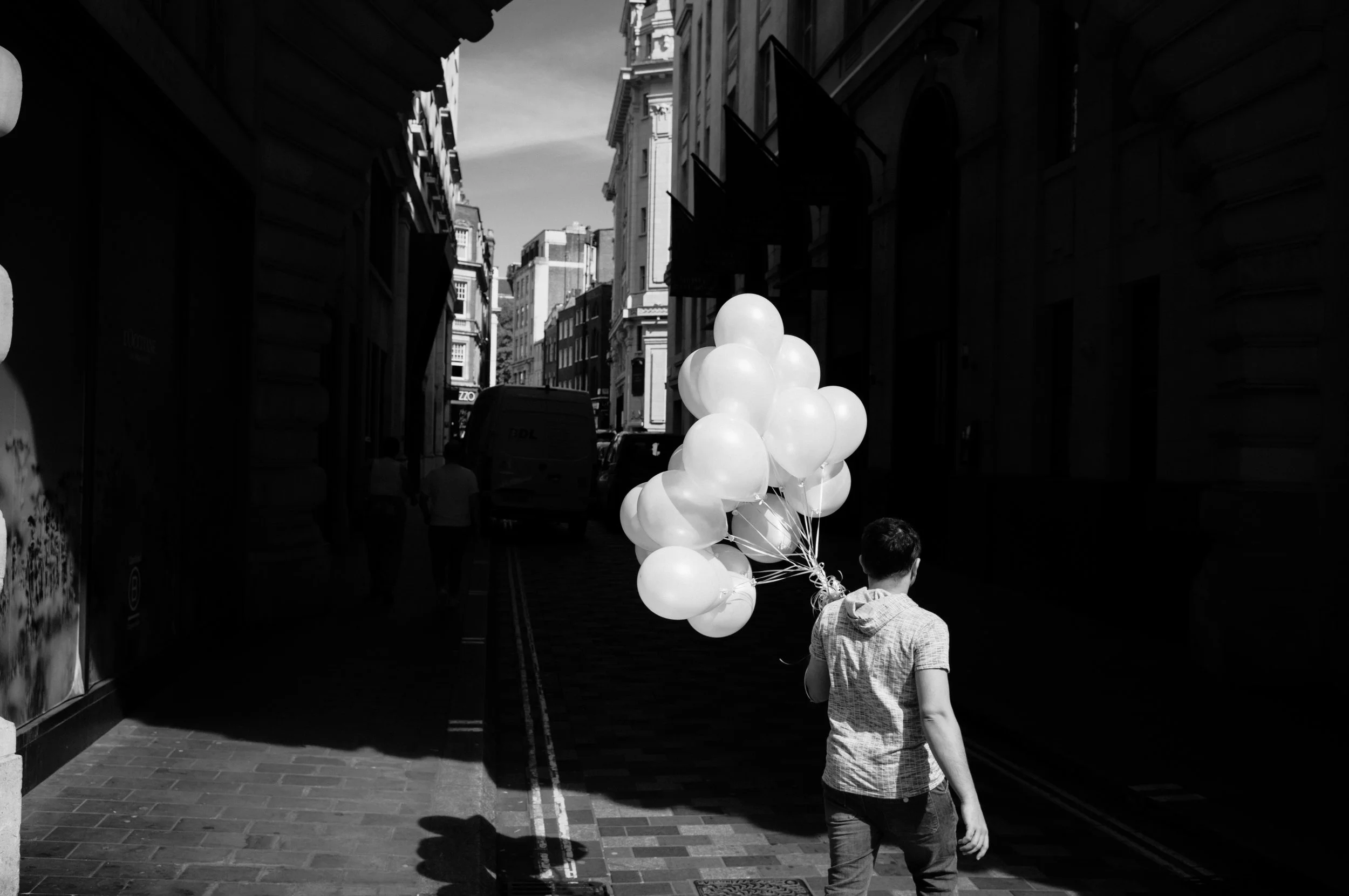
Colour is distracting.
A lot of people consider colour distracting. Colour is always asking for attention, it’s more detail you cannot help but notice.
A bright red coat or a green bin that might distract an otherwise interesting moment.
B&W neutralises all of that. It simplifies the scene meaning you focus on the real focal point, the main reason for the photograph… which might not be the red coat or green bin.
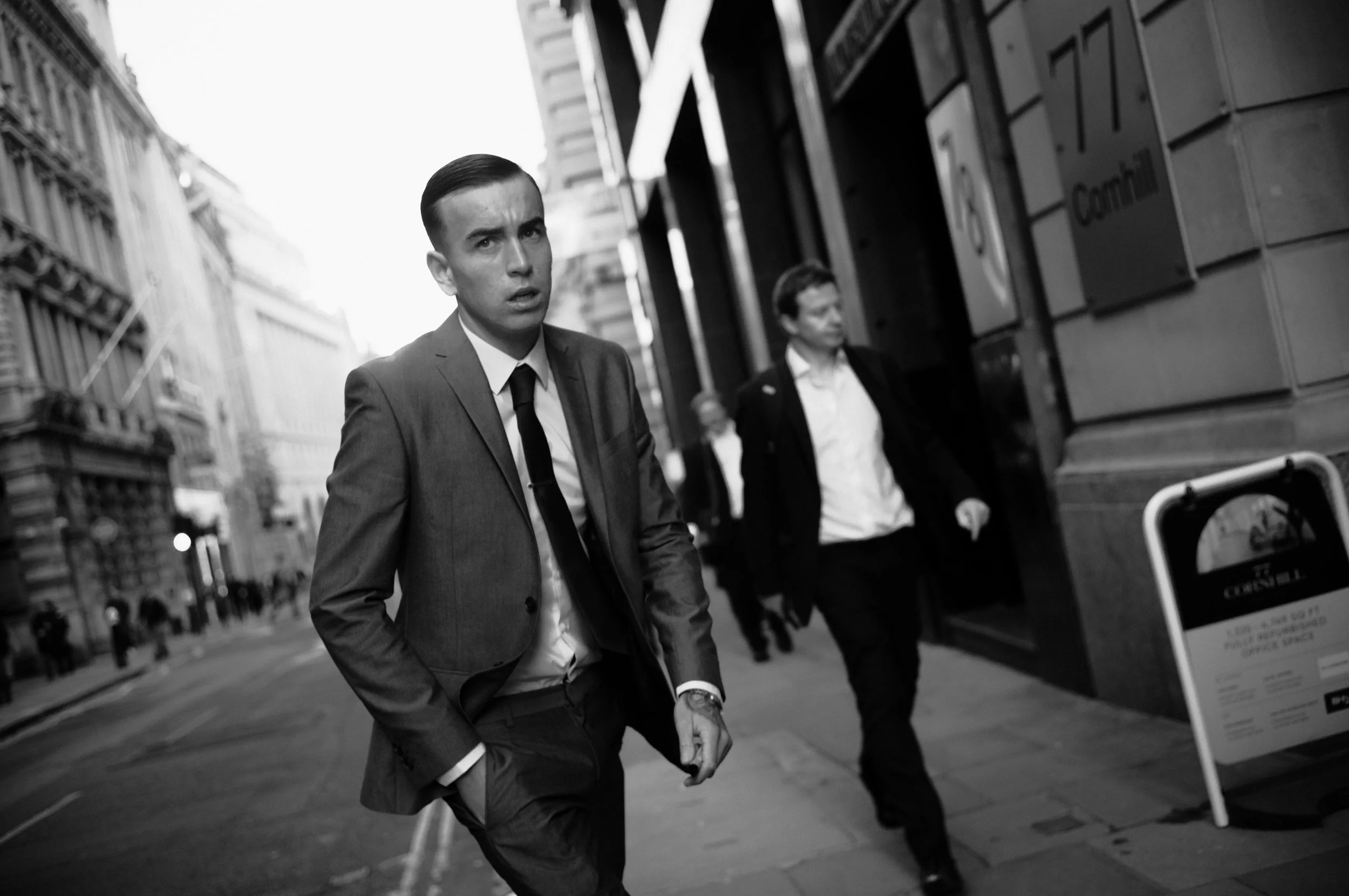
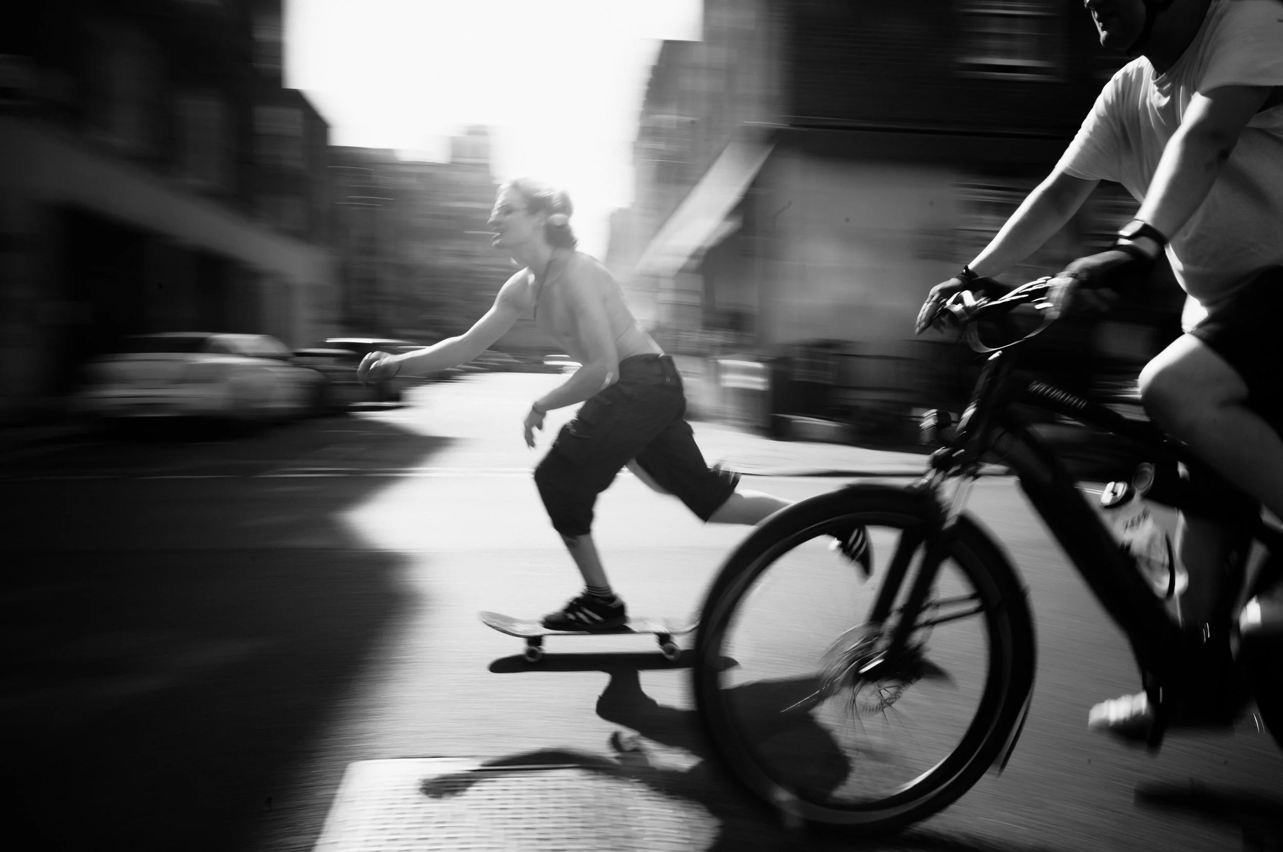
That rings true in street and documentary photography. When you're shooting in a busy environment, there are so many different elements competing for attention.
Colour can be chaos. In black and white, a photograph can becomes slightly more obvious.
And I think that's might be where the impression of B&W being more artistic comes from. A B&W image often looks more considered, more intentional - not because it necessarily is, but because the simplification does a lot of the heavy lifting.
An interesting exercise… that I don’t really have a conclusion for you but is fun to consider.
I always imagine your favourite B&W images, for example the photographs from Joseph Kouldeka’s book, Exiles… these are such beautiful images… but… would they be better in full colour? … I don’t have an answer for that.
Maybe some of them would, but maybe some of them might be worse. I guess we will never know.
The Cliche…
There's a running joke in photography.
If an image isn't working, if the light is flat or the colours are off or the whole thing is just… meh, “throw it in black and white and add some grain and it’s not arty”
It that funny because, there is actually some truth to that?
Black and white genuinely can salvage a mediocre image. A photograph with poor lighting, or weird white balance can be converted to monochrome and all of a sudden feel moody or considered.
Throw some grain on it to add texture and hide any technical problems. It’s all of a sudden not completely crap.
But it's also why the joke exists. The cliché exists because it actually works…
Because there's a difference between using B&W because it's the right call for that image, and using it because you're covering something up.
But I do think photographers making genuinely great B&W work aren't using it as a fix. They're using it because actually produces better work.
Is B&W Revered a little bit because it came first?
Is there a nostalgia argument underneath all of this?
Photography was black and white a long time. The images that define documentary photography from the likes of Cartier-Bresson and Robert Frank are almost entirely monochrome.
Mainly just because that was the only format available.
And then when colour arrived, the serious photographers - particularly in documentary and street largely stayed with B&W. As Martin Parr said himself.
"In the '70s, in Britain, if you were going to do serious photography, you were obliged to work in black and white." - Martin Parr
B&W photography was what all the best or most serious photographers had used previously. So does B&W photography kind of automatically inherit a high standard? Maybe.
But it does make me think of how a B&W image might be considered timeless.
I do this with my own work, i’m guilty of it. This print on the wall behind me, I describe one of it’s qualities as feeling timeless, it’s what I like about it.
A great B&W image from 1965 and one from last week exist in the same category.
Another question then, does colour date more easily than B&W? And maybe that timelessness of B&W might be another reason to consider it more artistic?
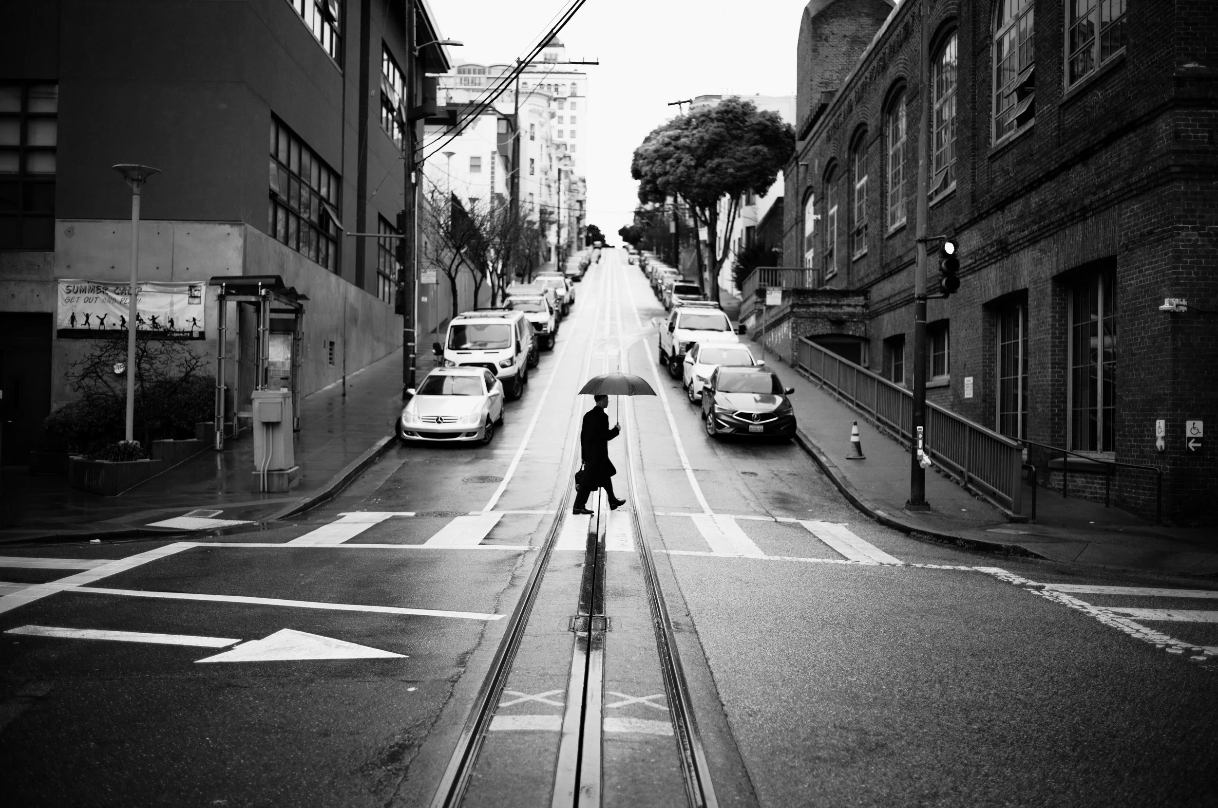
Colour gets my vote.
Here's my opinion, I prefer colour.
Not always. But most of the time.
Because colour is real. and I think… I prefer photographs that represent a version of reality.
Colour is the record of what actually happened and I think there's something genuinely important about that, especially in street and documentary work where the whole point is that you were there, and this is what you saw.
I found some bloody good quotes when writing this video and I love this quote from Ted Grant.
"When you photograph people in colour, you photograph their clothes. But when you photograph people in black and white, you photograph their souls." - Ted Grant
It's a great line. But I'd push back on it slightly because colour can most definitely be part of a photographs feeling.
Sometimes the orange glow of light creates an entire atmosphere.
Removing the colour would remove that atmosphere.
Around 70% of my finished photographs are in colour. That's just where my tends to land and I can’t say with any certainty why… just that I really enjoy colour.
Leica’s B&W High Contrast Profile.
Here's something specific that I have experienced personally.
I always shoot with the HC Black & White picture profile on my M11.
Not because I intend to make black and white images - I shoot RAW, so the profile doesn't affect the file - but because it completely changes how I see when I'm out.
The high contrast black and white preview strips away colour and shows me shape, form, and shadow. It emphasises contrast, highlights how light is behaving, and makes compositional decisions easier in the moment. It removes the visual noise.
Looking at a standard colour picture profile whilst shooting honestly does nothing for me. It's almost boring in a way. But that crunchy pop of contrast from the B&W profile.
There's something very satisfying and helpful about it.
The problem is the moment I open Lightroom, that preview is gone. I'm left with a full colour RAW file. Most of the time, that's exactly what I want. About 70% of my final photographs are in colour anyway. But for the other 30% — when the shoe fits and I know the image needs to be black and white — I want that Leica HC B&W look back. And it just isn't there.
So I built a preset for it and it’s available right now.
I shot against a colour card and matched exactly how the Leica HC B&W profile converts each colour into grey - red, green, skin tones, the sky.
So that dropping this preset onto a colour RAW file produces the same grayscale as the in-camera Leica HC black and white profile.
Then I pushed it slightly further with added texture and a touch more contrast to make it feel fully finished as an edit.
Combined with the Adobe Monochrome profile in Lightroom, it works consistently across camera systems, not just Leica’s.
I've been using it as my only B&W preset for months now, and I've just put it in on my site. XMP for desktop, DNG for mobile. Link below :)
Thanks
Mike
The Perfect High Contrast B&W Preset (in my opinion)
If you shoot Leica, you already know the HC Black & White picture profile. It’s how I always use my M11 - the high contrast black white helps emphasise light, shadow, highlights, shapes, form and ultimately improve my compositions on the move.
Looking at the regular coloured picture profiles doesn’t do much for me whilst shooting. They’re almost boring in a way that makes no difference to how I see.
But there’s something very satisfying and helpful about the crunchy pop of contrast from the b&w profile. But here’s my issue… I am always shooting RAW, probably like you.
That beautiful high contrast preview disappears the moment you open Lightroom and start developing, and you're left staring at a full colour file. Most of the time that's fine I end up with final colour photographs around 70% of the time.
But for the other 30%, when the shoe fits, you know it needs to be black and white and I want that previous Leica b&w look. But it's gone.
So I built this preset.
This preset is my attempt to recreate the Leica HC B&W profile as faithfully as possible inside Lightroom - and then push it just a little further with added texture and a touch more contrast, making it my new favourite B&W look i’ve seen from a preset… obviously i’m biased.
How I Made It:
This wasn't just a case of desaturating a file and tweaking the tone curve. To get this right, I shot against a colour card and painstakingly matched how the Leica HC B&W profile converts each colour into grey. The shade of grey that red becomes. The shade that green becomes. Skin tones. Sky. Foliage. Each one needed to be precise, so that when you drop this preset onto a colour RAW file, the tonal relationships match, as closely as possible what the Leica profile would have produced in-camera.
Combined with the Adobe Monochrome profile in Lightroom, the result is consistent and reliable across a range of camera files - not just Leica. I've tested it across multiple systems and it looks great to me.
This is the B&W preset I've been using personally for months. It's dialled.
What You Get:
XMP file for Lightroom desktop
DNG file for Lightroom mobile